Exterior rendering
Render Colour in Shade and Sun | West Bridgford
A pale render can look warmer, cooler or darker as daylight changes. A north-facing return and an open garden wall may therefore appear different even when the same product is used. That is worth examining before colour approval, but it does not mean each wall automatically needs a separate shade. A consistent comparison helps distinguish the desired appearance from unrealistic expectations of uniform light.

On this page
Choose the viewing conditions deliberately
Identify the elevations and times that matter to how you use the house. The front approach may be seen mainly in morning shade, while the rear wall is visible from a living space throughout the day. Visit those positions with the sample. A single bright photograph taken during a survey cannot represent all of them.
Use ordinary viewing conditions rather than trying to find one flattering angle. Overcast daylight can help compare the underlying shade, while angled sunlight reveals texture and profile. Both views are useful, but they answer different questions. Keep a note of the conditions if photographs are used to discuss the choice with someone who was not present.
Keep the actual product constant during comparison
Use samples of the proposed finish, with its intended grain or texture. If one board is painted and another uses the real render, the comparison may confuse material differences with colour differences. A painted board can help narrow an early palette, but the final decision should recognise what it does not show.
Silicone rendering and monocouche produce different surface characters. Even similar shades can read differently because of the texture. Establish suitable system options first, then compare within those options. Do not select a colour from one product and expect an unrelated material to reproduce it exactly without a representative sample.
Compare the retained materials in the same view
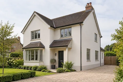
Brick, mortar, roof tiles, frames and paving affect how the new shade appears. View the sample beside a representative area rather than one unusually dark brick or newly replaced frame. The overall relationship is more useful than matching a single isolated colour. Step back far enough to judge the elevation as a composition.
If repairs or cleaning of retained materials are planned, understand the likely effect before approving the palette. Do not base a render choice on an unsupported promise that old brick will look new afterwards. The actual retained condition and any specified treatment should be the reference. Where another material is changing later, keep that uncertainty separate.

Avoid correcting every light difference with another shade
A different colour on a shaded wall can make sense as a design choice, but it can also create a boundary that looks unnecessary when the light changes. Compare the whole scheme before introducing it. A wall that looks darker at one time may receive direct light at another, while the difference between two actual products remains.
If multiple shades are selected, mark their precise boundaries, including corners and returns. The change needs to be workable with the specified system and the building details. A colour line should not be used to hide a movement joint or an unresolved material transition. The wall rendering guide explains why the physical edge remains part of the decision.
Worked example: one sample on three positions
Imagine placing the same sample beside the front brickwork, on a shaded side return and near the rear glazing. At the front, it relates well to the mortar. In the side passage it appears cooler. At the rear, reflected garden colours and bright light change the impression again. These observations do not establish that the supplied product varies; the surroundings and illumination have changed.
The owner might decide that one shade still gives the most coherent result. Alternatively, a deliberate contrasting rear extension could be selected for design reasons. The comparison should state which outcome is wanted and why. It should not claim that a second shade will perfectly cancel every daylight difference or that the material performs differently because it looks different.
Photographs can support the discussion, but keep the physical sample and product reference as the approval record. Automatic camera exposure and screen settings can alter the displayed result. This hypothetical exercise illustrates how to compare appearance; it is not a measurement of local sunshine or a recommendation for a particular product.
Include the existing surface if it is being retained
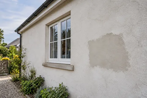
A colour change on old render retains its texture and underlying shape. Repairs may also remain visible through profile or grain differences even after the colour is unified. The render respray guide explains the condition and compatibility checks needed before coating. Colour approval should follow those checks rather than be treated as permission to cover any surface.
If a local patch is involved, ask for a suitable trial of the repair and any proposed decorative treatment. A sample on a perfectly flat new board may not show how the actual wall will look. The repair assessment should identify a sound boundary and compatible materials before appearance is judged.
| What changes | What it tells you |
|---|---|
| Daylight and angle | How the chosen surface reads in different conditions |
| Texture | How the material casts small shadows |
| Adjacent colours | How the shade relates to retained features |
| Camera settings | Why photographs are not a colour standard |
| Actual product | The specification that must remain identifiable |
Approve the choice in a form that can be used
Record the manufacturer, product, shade and texture, and identify the approved sample. Where several people make the decision, have them view the same options in the same positions where practical. A series of messages referring to the lighter one becomes unreliable once boards have been moved or discarded.
If availability or design changes lead to another product, revisit both compatibility and appearance. A similar shade name is not a guaranteed equivalent. Keep superseded options separate from the current specification so the installer is not left choosing between conflicting references. The approved colour should be easy to identify without reconstructing the whole design conversation.
Check who has authority to approve the sample
Where several owners or a managing party are involved, establish the approval route before samples are produced. The person choosing a shade may not be authorised to change the extent of work or a controlled exterior. Keep those decisions separate and obtain the relevant agreement through the proper project contact.
For an ordinary household, a simpler arrangement may be enough: one dated note identifying the accepted sample and who agreed it. The point is not to add paperwork for its own sake. It is to avoid an installer receiving a late colour instruction from someone who has not seen the agreed option, or treating an informal preference as permission to change the specification.
Judge the completed work against the agreed intention
Review the finish at an appropriate stage for the product and conditions, using the accepted sample and specification. Separate normal changes in light from concerns about texture, profile or incomplete work. If something needs review, describe it specifically and identify its location rather than asking for a wall to look identical under every lighting condition.
The West Bridgford rendering homepage connects the material guides and broader exterior planning. Use those technical choices alongside the visual comparison. A well-defined colour decision supports the project, but it does not establish background readiness, suitable application conditions or completed junctions by itself.
Common questions
Will one shade look the same on every elevation?
Not under every light and viewing condition. Compare it in the relevant positions and agree the intended overall effect.
Should I use a darker shade on the sunny side?
That is a design option to test, not a general rule. Consider how the scheme looks when the light changes and where the colour boundary sits.
Can a photograph serve as the final colour reference?
It is useful supporting information, but the actual product reference and physical sample are more dependable for approval.
Does colour variation prove poor performance?
Appearance alone does not establish a performance issue. Assess any concern against the installed system, conditions and relevant evidence.
See housing and planning information for West Bridgford and nearby places, including the source and geography behind each figure.